US Energy Production by Type and State
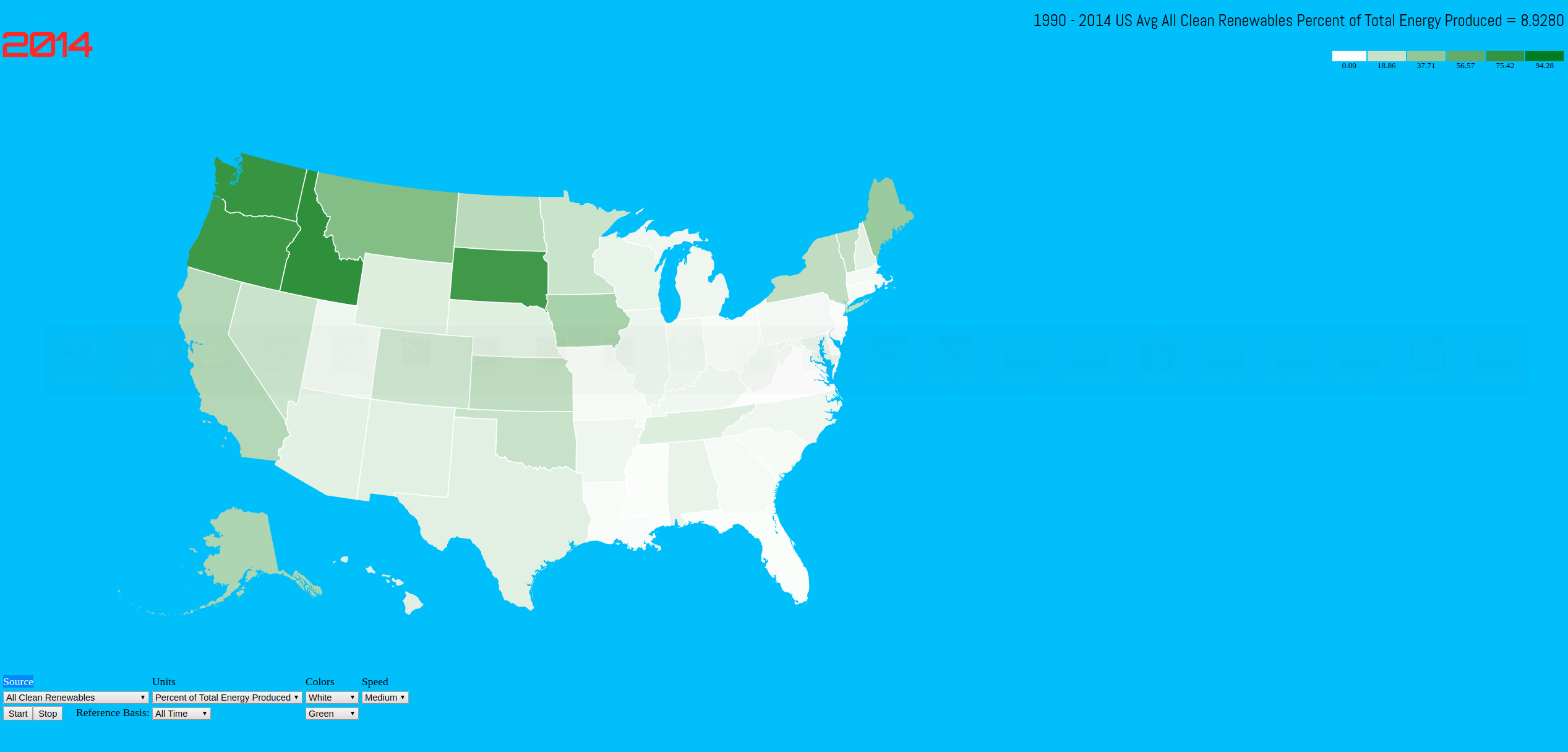 We were taksed with building an effective data visualizetion that tells a story, allowing a reader to explore trends or patterns. I based the project on D3.js, and used lean HTML and CSS to do all the formatting. I decided to use a dataset on energy production by state at the US Energy Information Administration site. After spending some time with the data, it became clear that looking at only energy production for each state didn't give a lot of perspective. One issue is larger states, like California completely overshadowed smaller states because the imbalance between their energy production is so great. It was clear there needed to be some ratio to make the comparisons between states make sense. I found a dataset showing US population by state for the same time period, 1990 - 2014, on the US Census website. I also found a dataset on the US Dept. of Commerce Bureau of Economic Analysis website that showed GDP by state for the same time period. I decided to join both of these datasets by state and year to the energy dataset to compare energy production by state per capita, or energy by state per dollar GDP. The map data was in GeoJSON format, and was drawn using D3 and SVG. I used a timer, and some user controls to provide animation and interactivity with the data. The source code is posted here.